Created new flower 1/8th for the CO based on brand and state guidelines. In these designs, I showcased the type of flower with each dominance. Of course I had to include Willie Nelson himself as well!
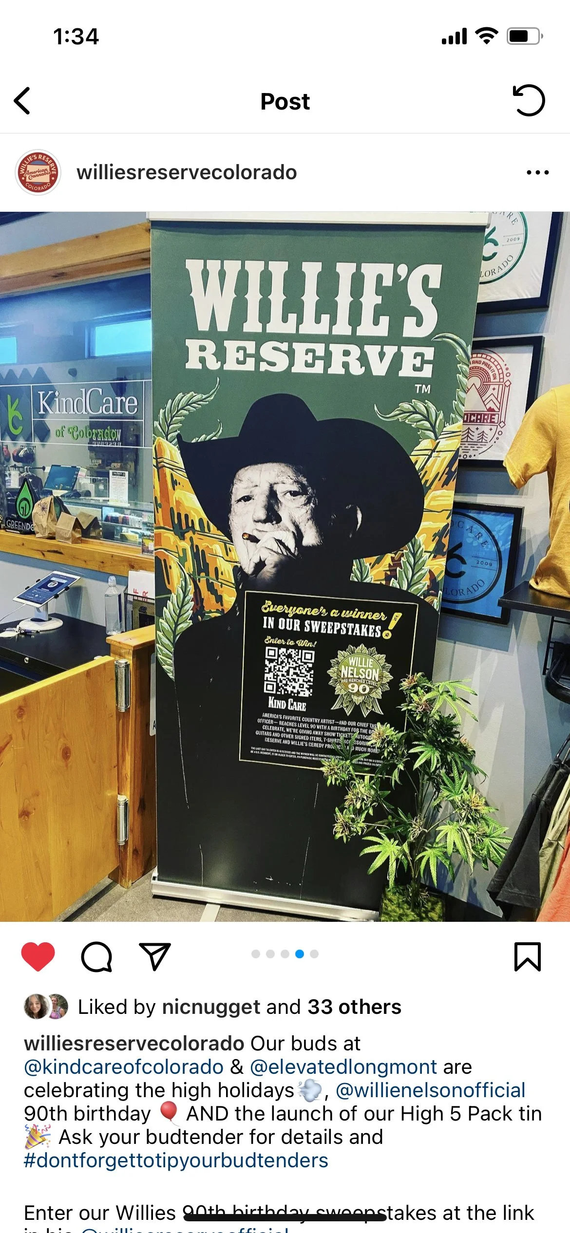
For this Campaign, I worked closely with an Illustrator to Art Direct this National Sweepstakes. Created digital assets, and an in store pop-up.
On Willie Nelson’s Outlaw Tour Summer 2023!
One of the tasks I took on while working at Western Bud was doing a complete over haul of their Website. Since the brand is very in depth with PNW culture, I decided that taking an earthy back ground was the way to introduce us to our digital audience. With this particular gif, the mist also looks very similar to smoke, which fits in perfectly for the products Western Bud offers. It also opens up with a banner at the top that is adjustable to promote Sales and Promotions. As you scroll down on desktop you can see all four stores, the button at the top gets you to each location’s online store and the map underneath gets you directions to each location. This website also needed to be mobile friendly, so as you scroll each store is showcased.
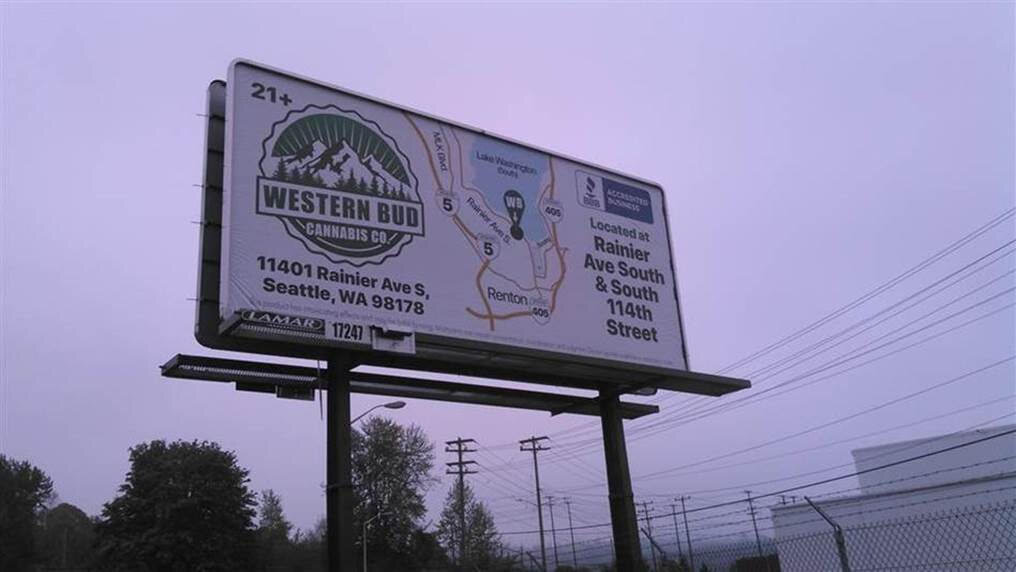
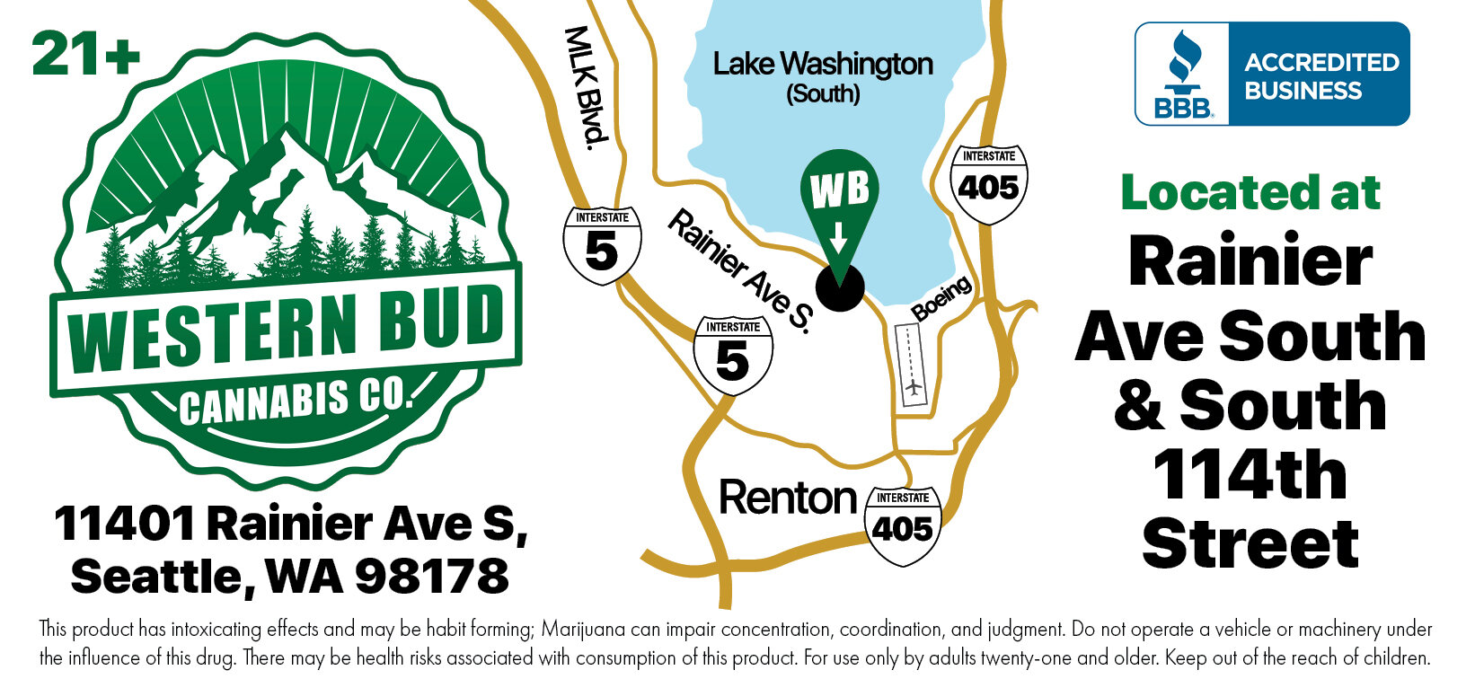
In making billboards for Western Bud, we were very limited to what we could say or do since the product is not legal on a federal level. Also the LCB changes rules on a regular basis. I would have LOVED to have done something more eye catching with a short tagline, but sadly my dreams were crushed. Therefore we went with more directions and showcasing local sites.
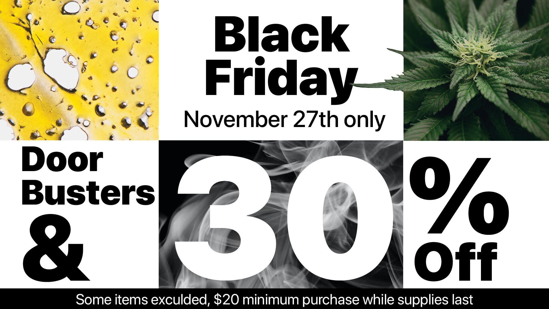
Like any other retailer, Western Bud has Sales and Promos. I art directed and implemented the advertisements for all of these. Sometimes I would also adjust the logo design to reflect the theme of the sale.
Social is difficult in the cannabis space since popular feeds like IG and FB don’t allow advertisement of sales. For our pages, I decided to showcase our stores and mainly store pups! My role in this was to hire a photographer, give direction and make posts accordingly.
For the past couple years I’ve created menu’s for Dukes Seafood In Seattle, Washington. Needless to say, I always get so hungry when I work on these.
This is the Main Menu for Dukes, I actually updated it from a ten page Menu to a front and back Tabloid due to cutting costs due to Covid
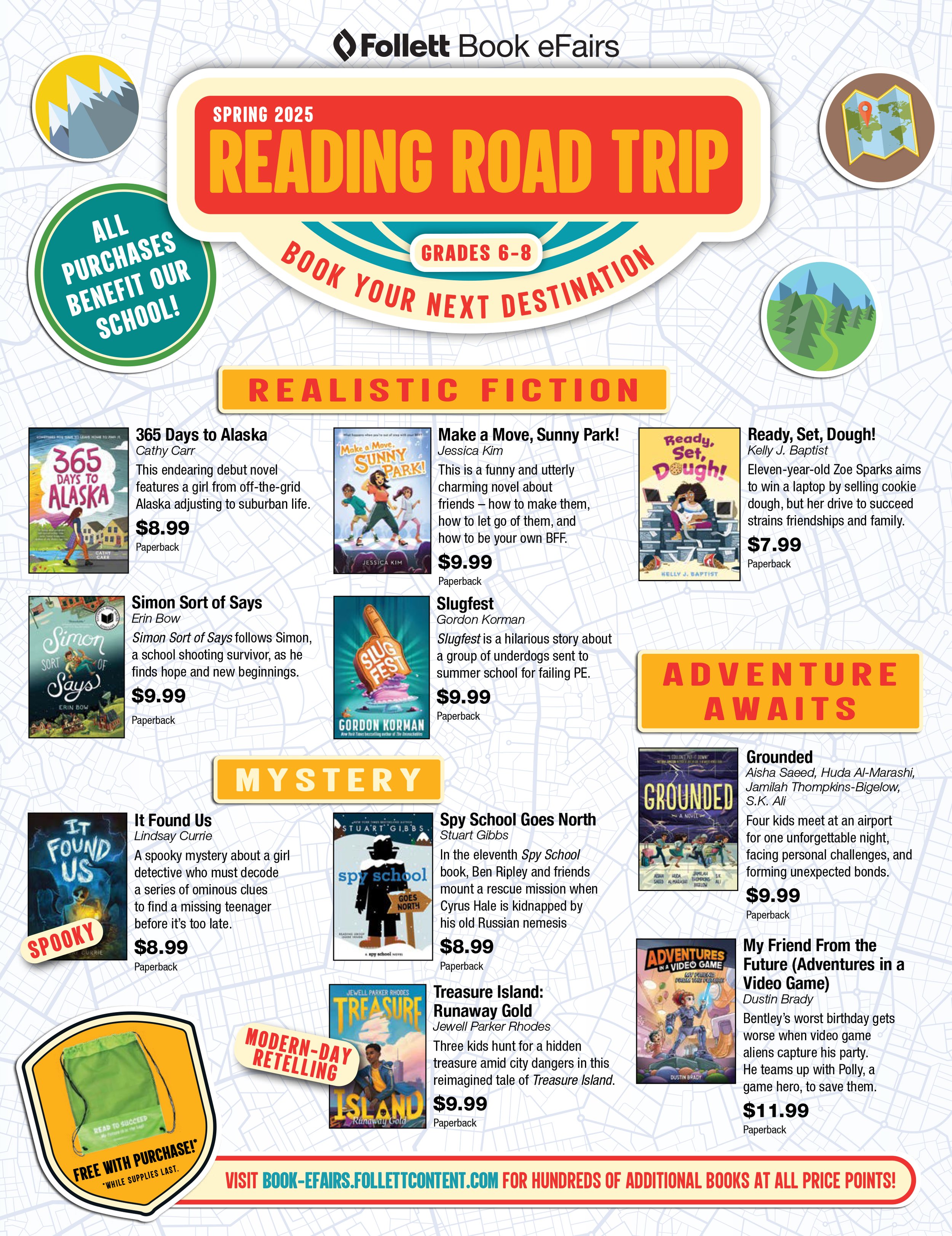
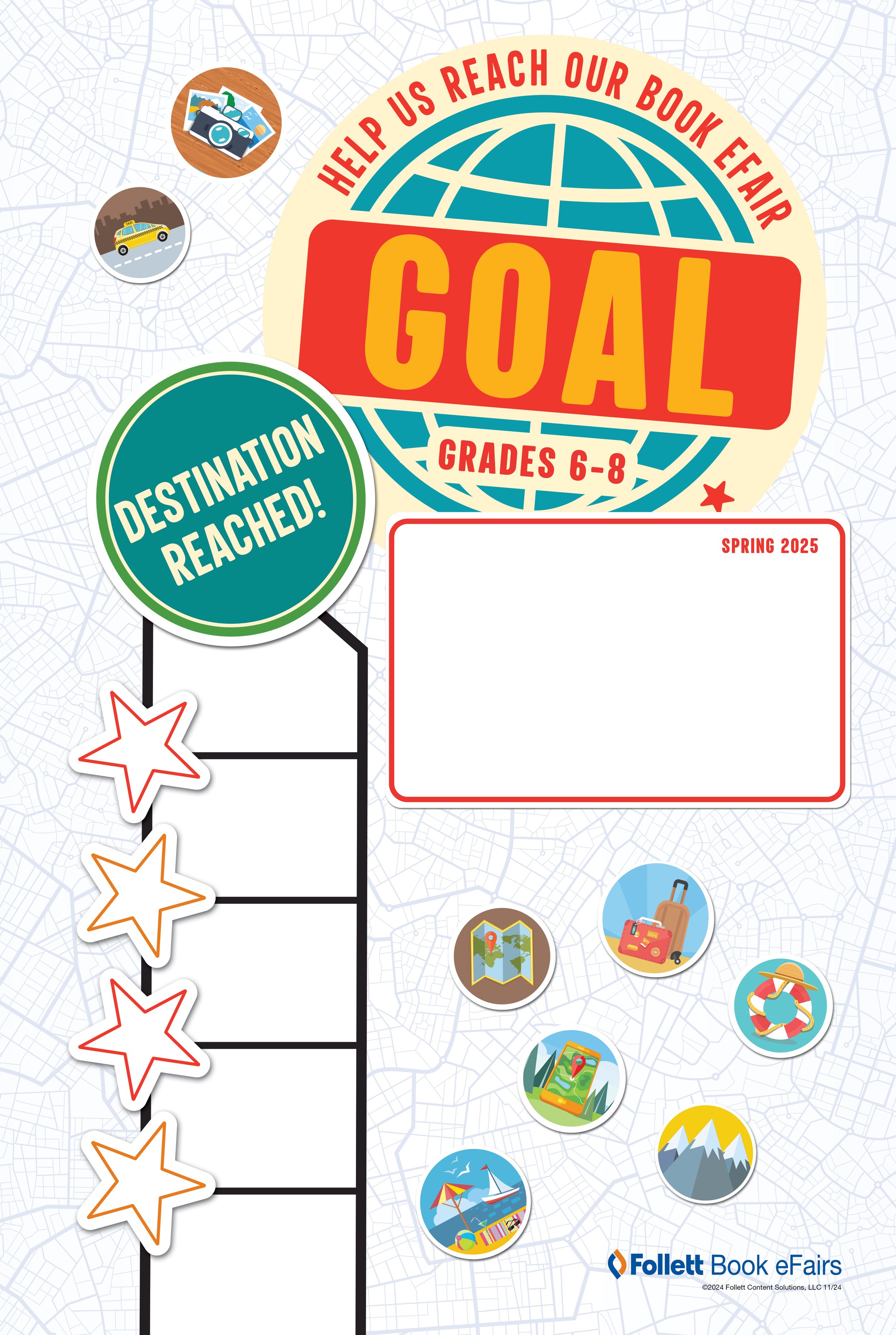
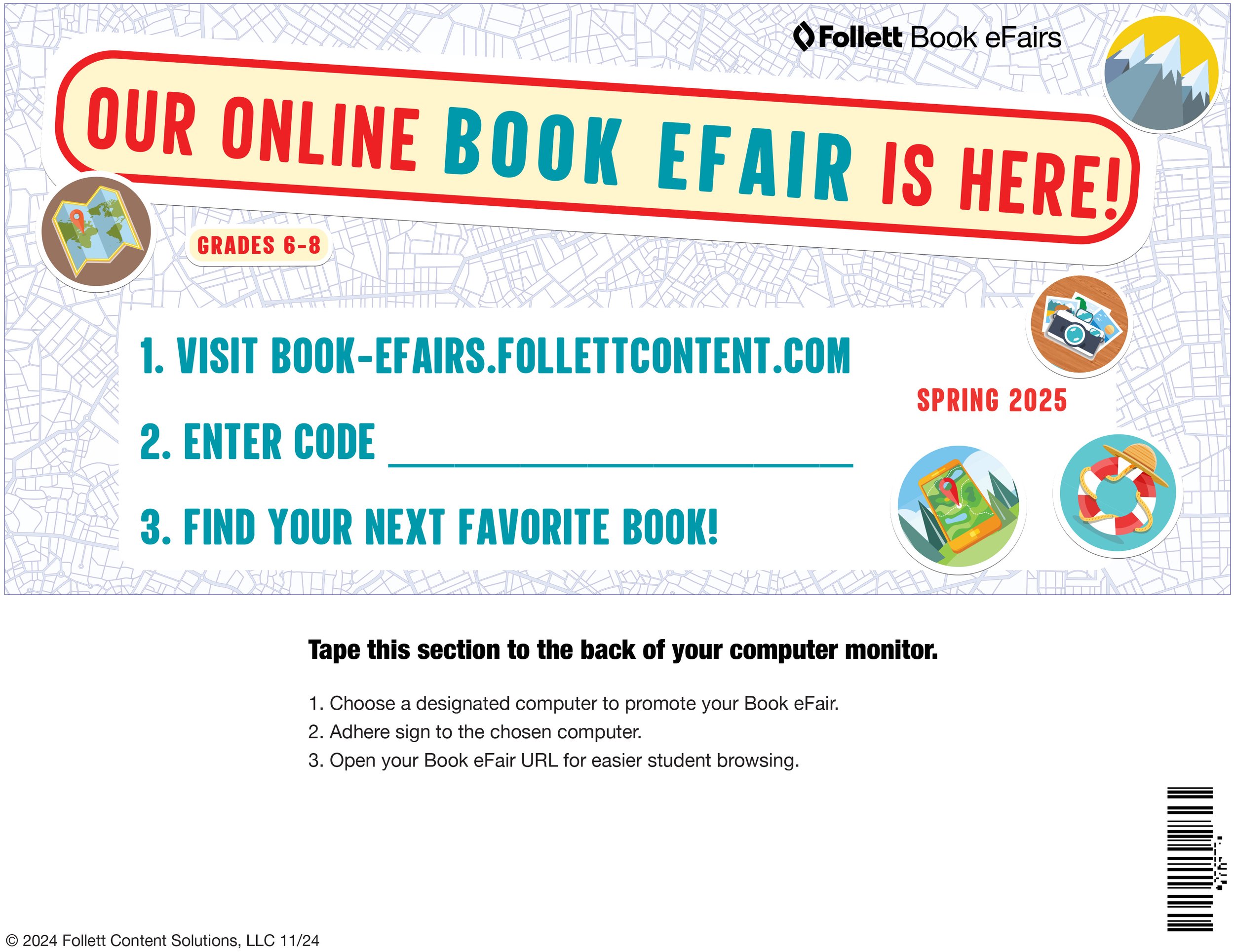
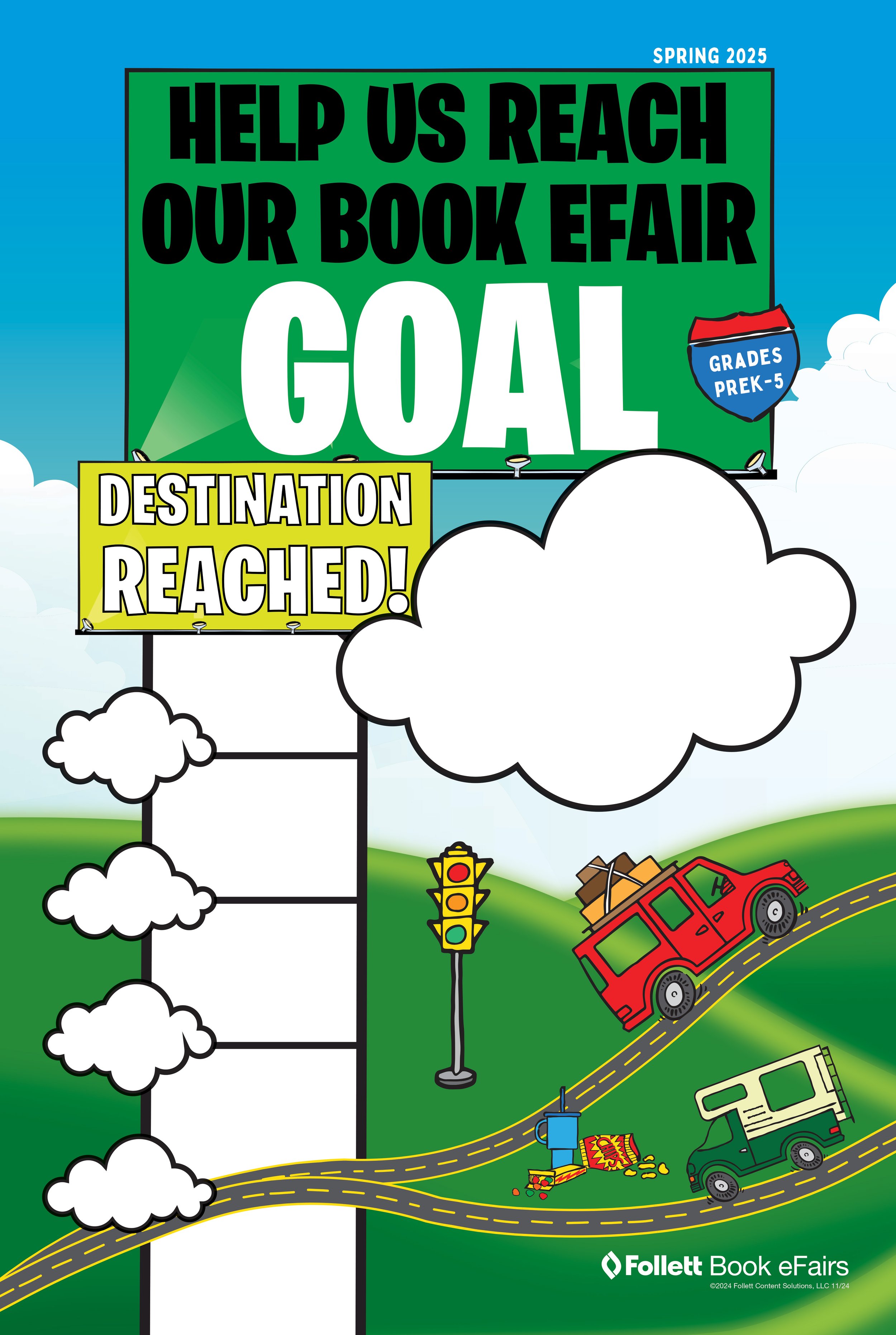
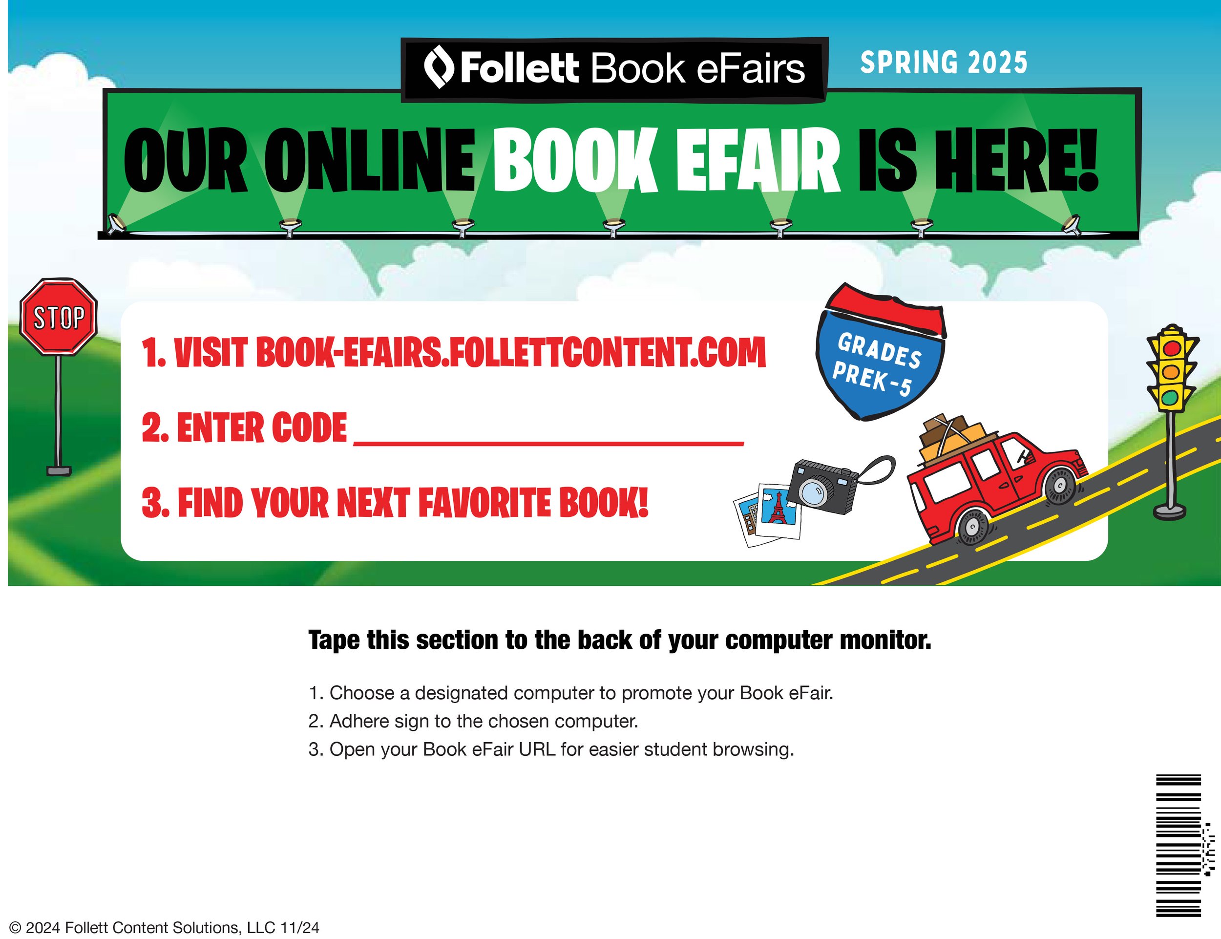
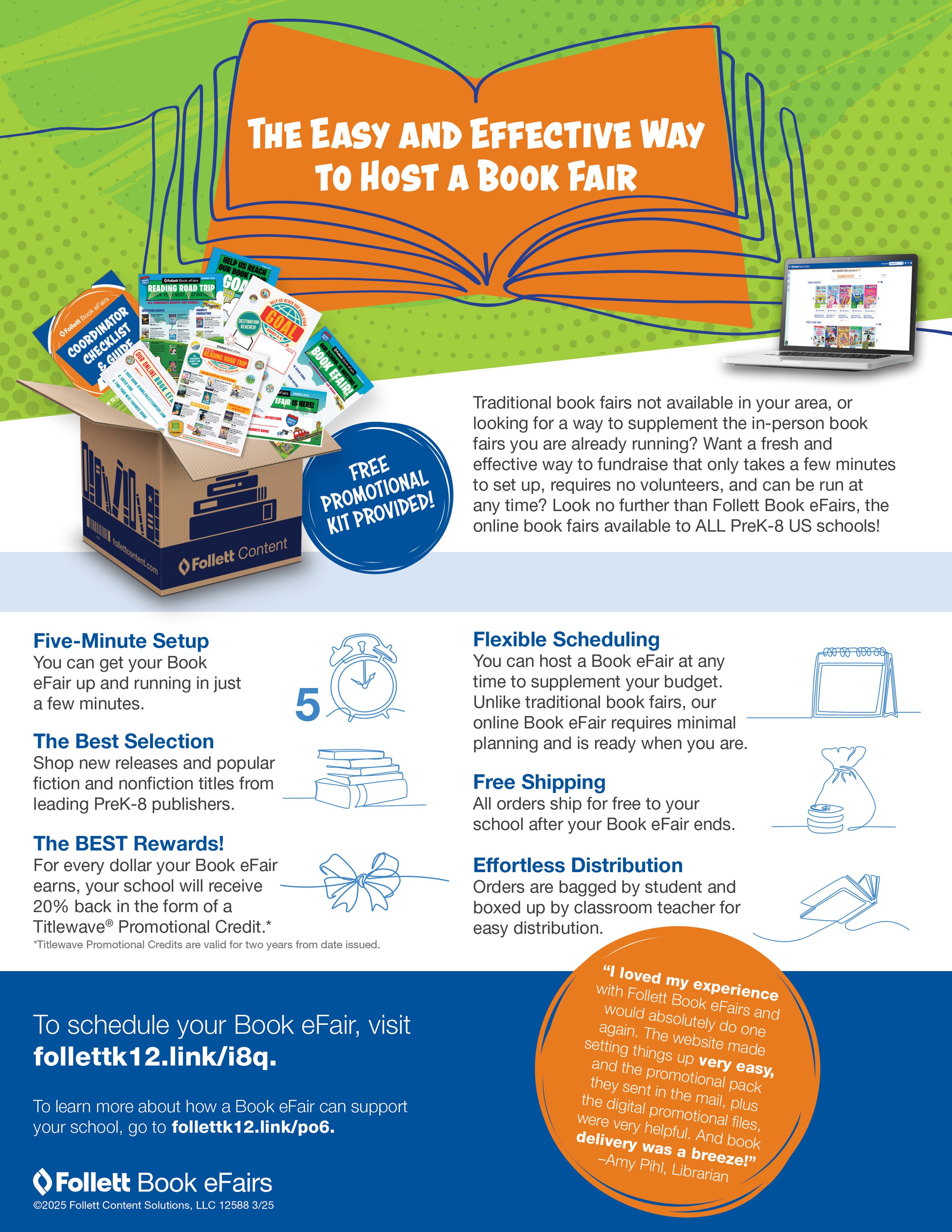
E-Fairs is a remote book fair Follett Content releases twice a year. Along with the books, students also get a catalog, a goals poster, computer sign and promo flyer! I also create the sell sheets for marketing to hand out. Each E-Fair has a unique theme while for core business sell sheets, I stick close to Follett’s brand guidelines.
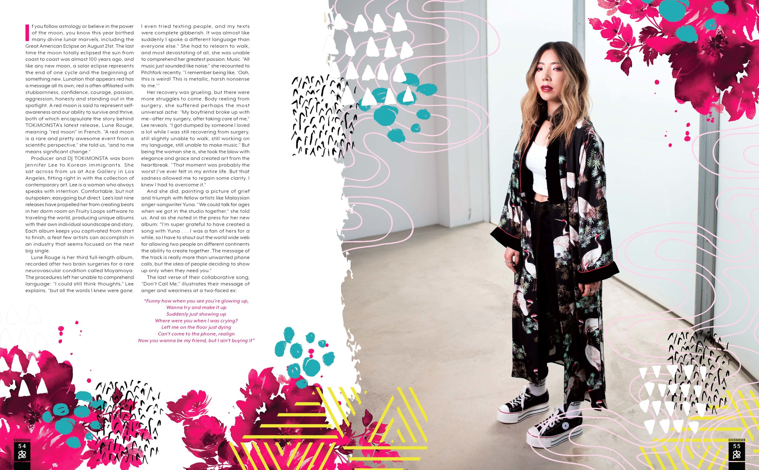
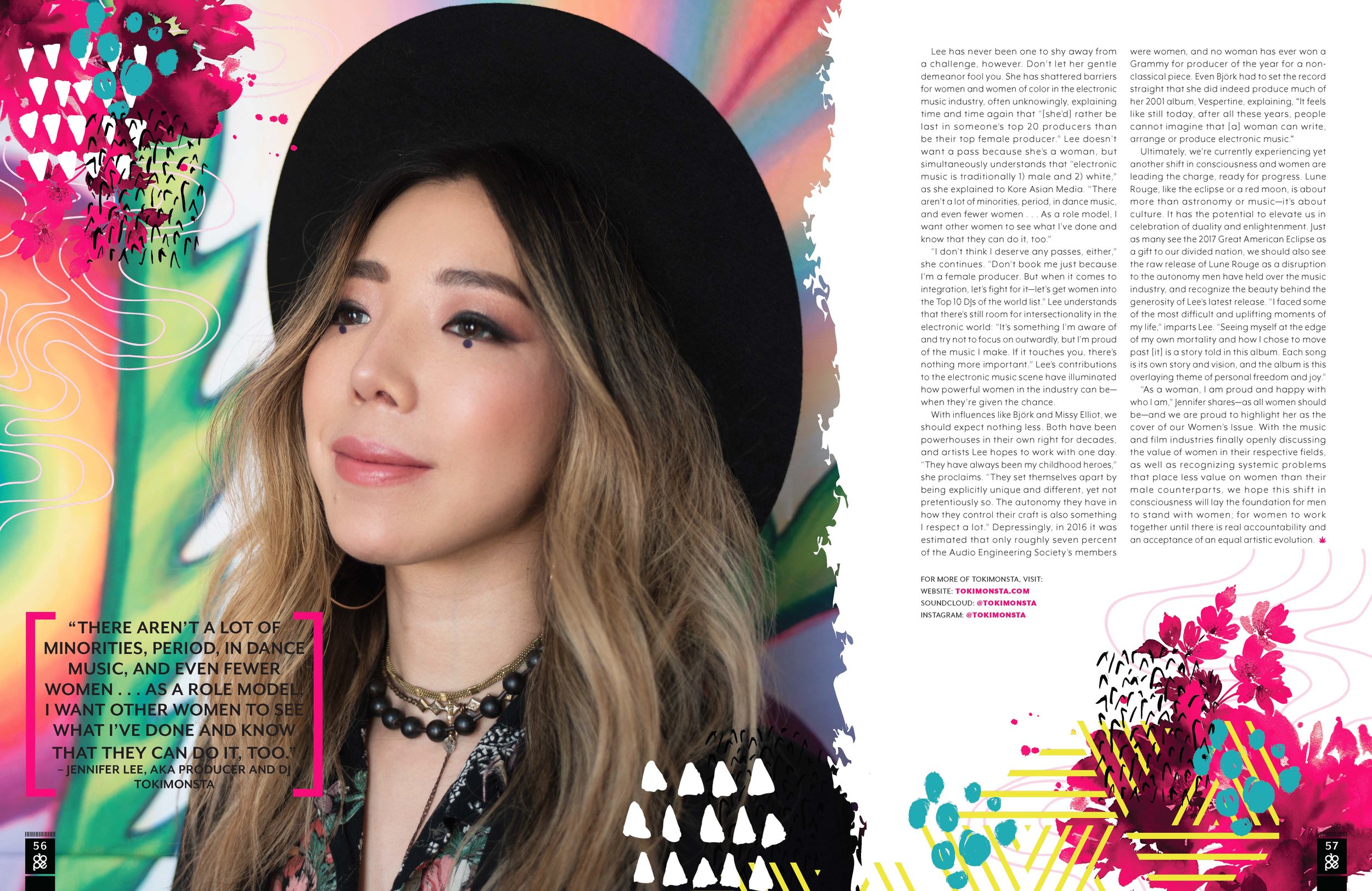
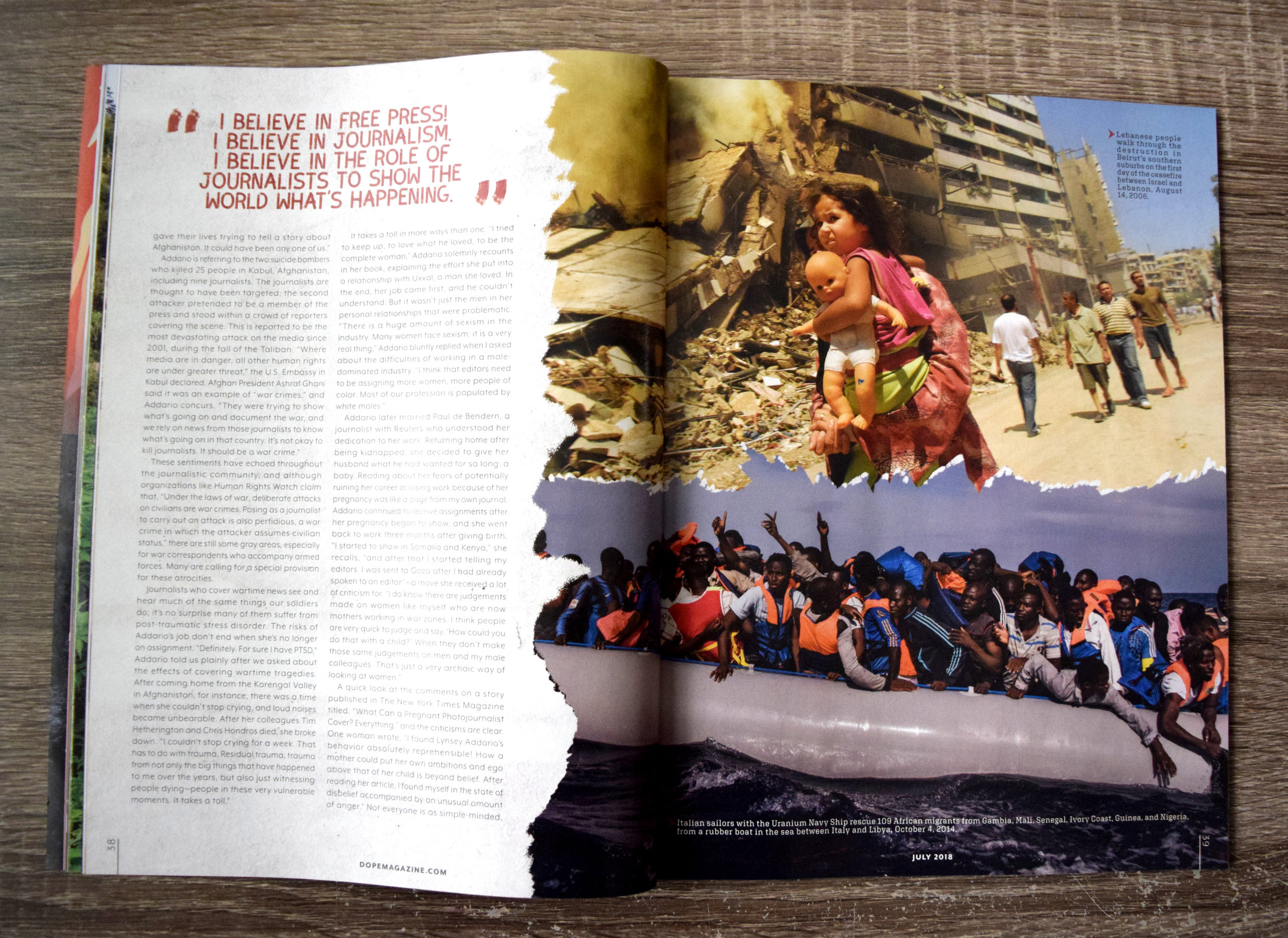
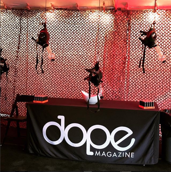
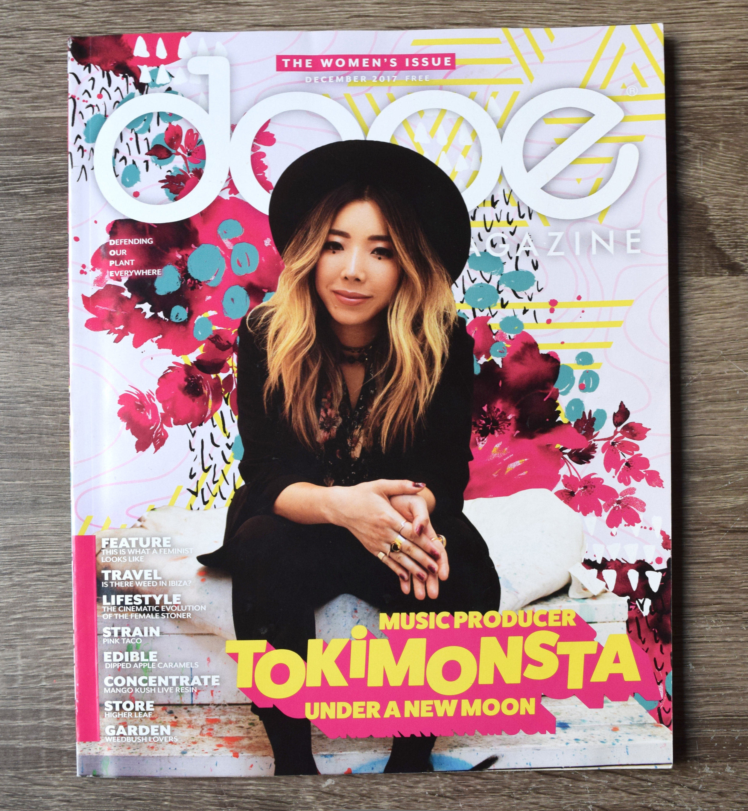
I worked at a cannabis magazine, called DOPE Magazine. I made spreads, inspired by stories from people who support the plant, in order to dispel stereotypes. I loved it. These are spreads where I did not include illustration work.
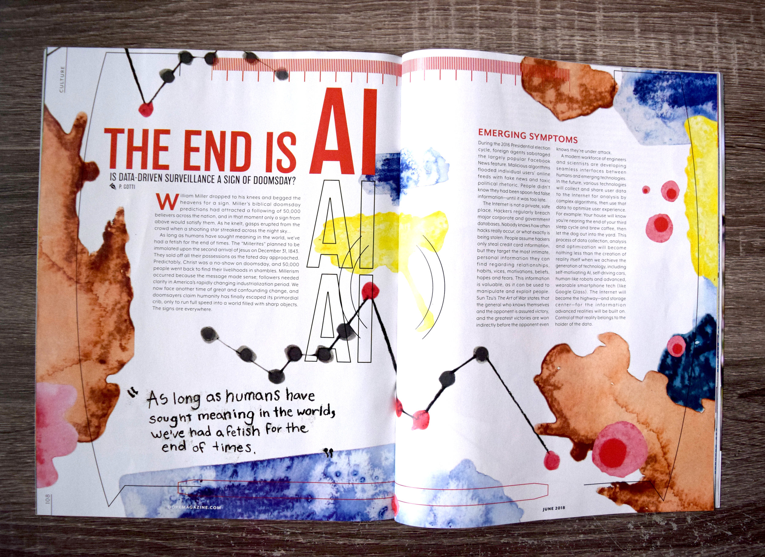
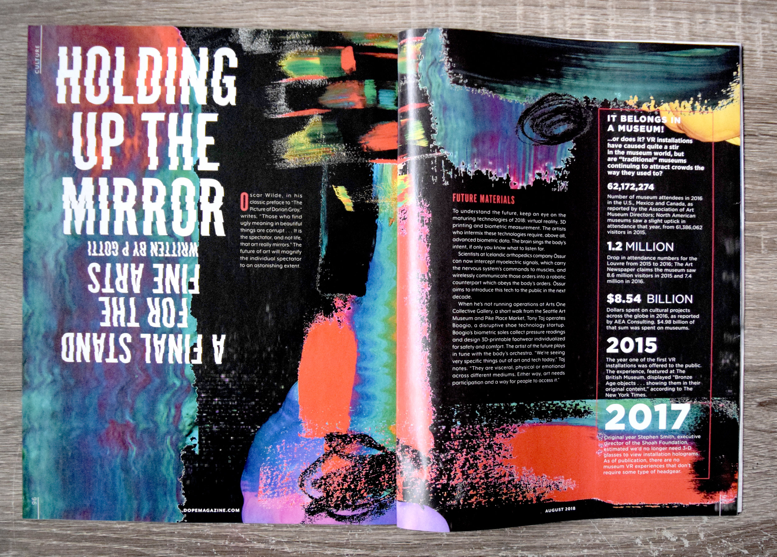
Layouts that I’ve done for Dope Media that include my illustrations.
Power Point for Violence Prevention and Job Readiness Program, helping people prepare for job interviews.
DEI, Anit-Bias and Nepotism Power Point, to help with job preparedness
Examples of slide concepts for client review to move forward for over all look and feel of power point presentations.
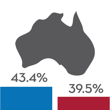
The International Education Association of Australia needed to gain funding. They had studies conducted that concluded that it is indeed worth becoming an international student at one of Australia's universities. I took their data and interpreted into an infographic for print and web. Following their brand guidelines, this is the result.
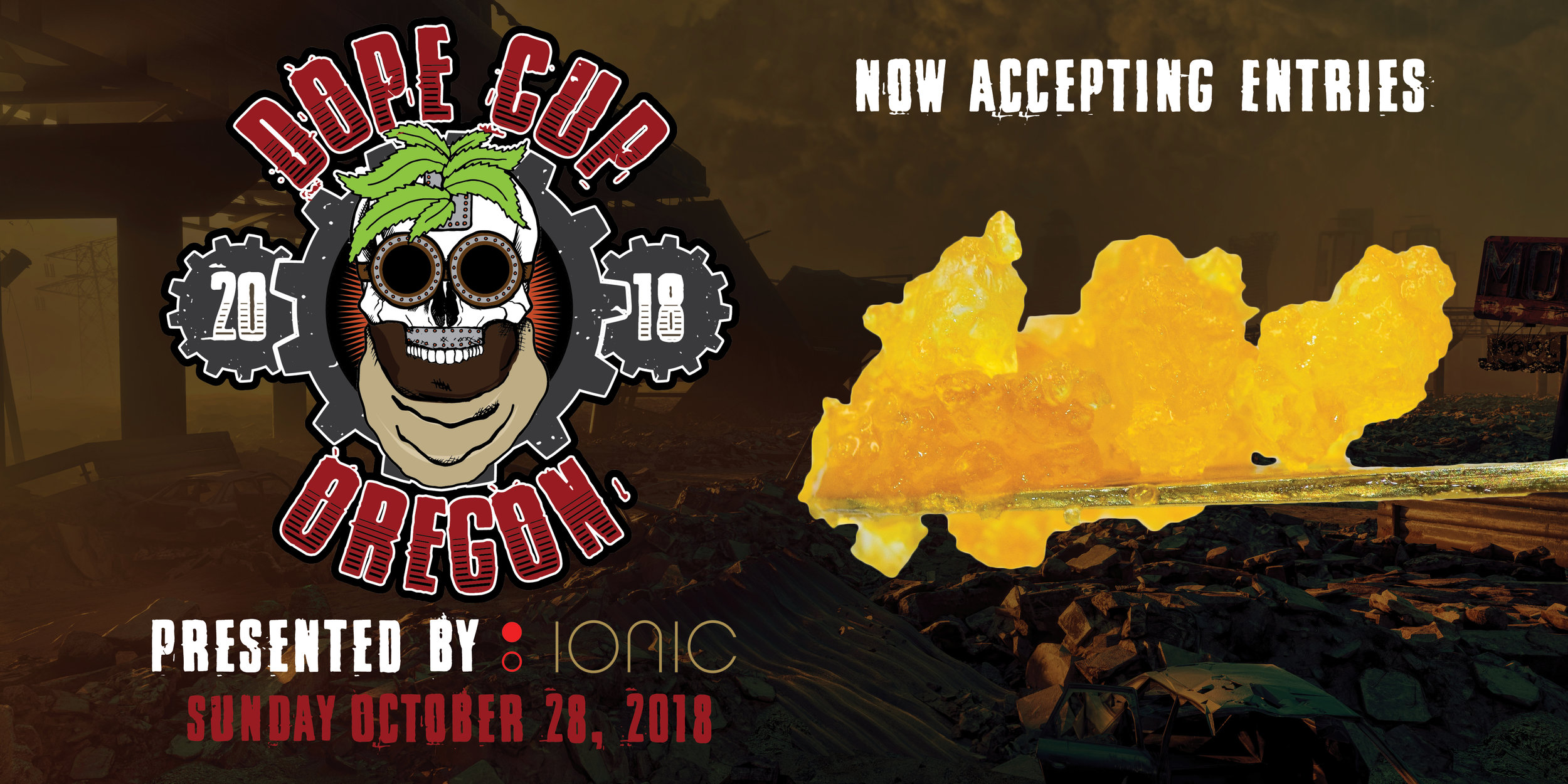
DOPE CUP Oregon was a cannabis event that took place in Portland,OR in October 2018. I art directed the event, illustrated the logo, created all digital assets, flyers, vender banners, came up with cannabis activities and any other visual element to the event. Wu-tang Clan member Ghostface Killa headlined which brought in over 3,000 attendees. It was certainly a DOPE time!
Before I figured out that if I wasn't in a creative field I'd go completely insane, I was a nursing major. I love science and learning about the human body but realized after a few years that I liked making the anatomical flow charts more than committing them to memory. So this project is essentially a throw back to the days I was forced to reinterpret massive amounts of text into a visual form so I could attempt to learn it.
I made a fold up study guide of the human nervous system. As you can see, I created icons for almost every element of it. I think this will help more visual people such as myself, to retain information.
I enjoy pizza.
So why shouldn't they get to enjoy themseleves as much as I do them?